Visualizing World War II
Visualizing the Past (World War II)
14–18 minutes
If you’ve been reading this blog for any length of time, you’ll know that maps and history are two of my favorite things. I love history because I love learning about the vast panoply of the human experience, the millions of twisting threads of time that created the world we live in today. And I love maps because I don’t think you can really understand the world without being able to picture it. Maps are such amazing tools, laying out in detail how the world functions, its geography and politics and topography, and the ways in which those change over time. It probably won’t surprise you, then, to know that I like historical maps quite a lot. Learning about how someone chooses to depict the world can tell you quite a lot about their point of view, and seeing the way in which people in different times make different choices about how and what to illustrate can show you how our perception of the world has changed. That’s what we’re going to do today. I have here a small collection of historical maps that I think are really cool, and that I think can teach us something about our shared past.
In today’s edition, we’re going to look at the Second World War, with a particular focus on the maps that newspapers would print so their readership could follow along as the world burned. So, without further ado:
Previous Installments: WWI, Part One, Part Two, Part Three
In February 1942, as the United States reeled from the Pearl Harbor attack and girded itself for intercontinental warfare, President Franklin D. Roosevelt gave a speech to the American people about the coming conflict:
This war is a new kind of war. It is different from all other wars of the past, not only in its methods and weapons but also in its geography. It is warfare in terms of every continent, every island, every sea, every air lane in the world.
That is the reason why I have asked you to take out and spread before you a map of the whole earth, and to follow with me the references which I shall make to the world-encircling battle lines of this war. Many questions will, I fear, remain unanswered tonight; but I know you will realize that I cannot cover everything in any one short report to the people.
Fireside Chat, February 23, 1942, Franklin D. Roosevelt (Source)
This was a global war, fought by a modern population with access to modern information sources. The new technologies that allowed millions of men to be mobilized allowed their families at home to follow along with a level of detail never before possible, and newspapers rushed to provide it.

We’ll start with this map, published in the Los Angeles Times on September 10th, 1939, only ten days after Germany’s invasion of Poland. This is a wonderful example of what I love about this genre of work–the depth of detail and information that newspapers were attempting to convey to their readers. In 1939, the world was beginning to fall to pieces, and everybody knew it, and a lot of people wanted to know more. This map includes instructions for removing it from the paper and preserving it, under the assumption that you’d want to keep it to follow the course of the conflict. What I also love about this is that it’s from early enough in the war that the patterns and narratives that we take for granted haven’t coalesced yet. The USSR, Italy, and Balkan states are still neutral, and Charles H. Owens of The Times art staff takes note of potential rail and sea corridors with which the Western Allies could supply Poland–something that never materialized. Note also the focus on naval bases, fortifications, strategic resources, and the aerial distance between cities, as the artist tries to grapple with the new kind of warfare that was still being born. It’s a wonderful achievement.
I cannot help but notice, however, that Mr. Owens has forgotten about the existence of Estonia.

Jumping back in time a few months, here we have a map of Germany at its greatest pre-war extent, following the Anschluss, Munich Agreement, and the Occupation of Czechoslovakia. There are a few things of interest about this. Firstly, how contemporaneous it is–dated May 1939, it was only printed three months after the final events depicted had occurred. Second is how granular it is. We tend to blur many of the fine distinctions and territorial adjustments made by the NSDAP during this period, seeing everything as Allies, Axis, and/or Soviet, but issues like the independence of Slovakia and the cession of Carpatho-Ukraine to Hungary were of vital interest to participants at the time. Third and last, we should take note of the source, the German Library of Information, in New York. This was a Nazi propaganda bureau established in 1936, specifically to try and influence American public opinion and popularize the German perspective on international affairs. (I appreciate the comparison of the German Reich’s scale to that of Texas, which I suspect was an attempt to emphasize how small it still was compared to the US). Today we’re so used to engaging with this time period from the perspective of either victors or apologists, that we forget that something like this map of territorial conquest–now seen only as an ominous indictment–could be presented as an achievement to be celebrated, even to a neutral audience.

Another propaganda map, this one published by the Los Angeles Examiner in 1937, showing the potential results of an American defeat in another world war, the specter of which was already rearing up over Europe. What’s fun about this one is that it is agnostic on who exactly would be defeating us; several years before the outbreak of the war, the coalition lines not yet firmly drawn, the Examiner focuses on speculating as to what resources and regions would be most coveted by the “victorious powers”, leaving it up to the reader’s imagination who those would be, exactly. It’s an intriguing look at the kind of perspective that I’m trying to showcase here, before hindsight solidified our understanding of the possible. Note, for example, that the main comparison point here is the post-WWI fate of Germany and Austria, as well as the Partitions of Poland. The _Los Angeles Examine_r opposed America’s entry into the First World War, and you can perhaps see echoes of that here.

The San Francisco Examiner published this map on June 2nd, 1940, just eight days before Italy entered the war on the side of the Axis, and it’s an absolutely gorgeous example of its genre. This map doesn’t just show you Italy and the Mediterranean, it attempts to give the reader the geopolitical and geographic context for the war, and what the various powers hoped to gain from it. Note how the headline correctly identifies the driving force behind Mussolini’s ambitions, completing the goals that Italy had failed to achieve in WWI. Three days after this was printed, Mussolini would tell Chief of the General Staff Pietro Badoglio “I only need a few thousand dead so that I can sit at the peace conference as a man who has fought”. I love this map because it really does tell you so much of what would happen over the next few years in this theater of war; from the conflicts in the Balkans as nations chose sides or were torn apart, the various imperialist and irredentist claims that Il Duce was pushing against his neighbors, to the vital supply lines between Sicily and Tripoli that Rommel would depend on, and the thorn in its side at Malta, and Italy’s dependence on foreign trade routes with the Americas and the British Empire. The game board is set, the pieces are ready, and now we’re just waiting for someone to make the first move.
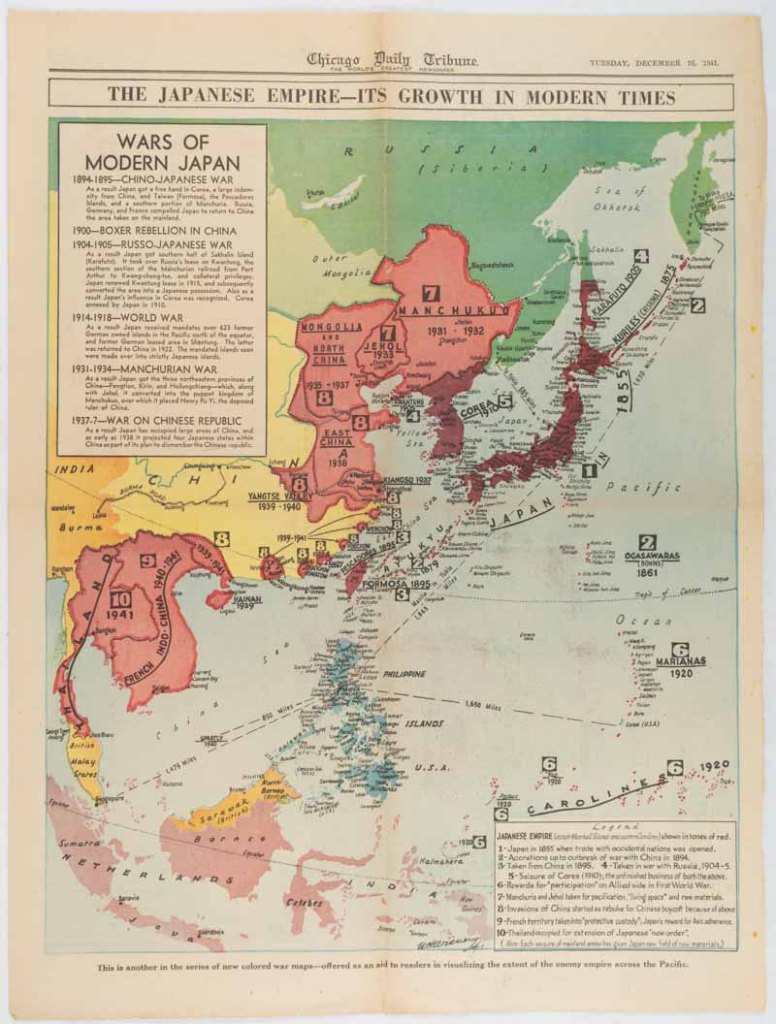
Another example of the same genre, this one published by the Chicago Daily Tribune, a week after Pearl Harbor. The focus here is to show how the Japanese Empire has expanded over the previous fifty years, through the First Sino-Japanese War, Russo-Japanese War, World War I, and Second-Sino-Japanese War, leading up to the present crisis, with the Imperial Japanese Army and Navy threatening to overrun the East Indies and Philippines. The breakdown in expansion over time is so valuable, showing how these crises didn’t emerge from thin air, or from some primordial conflict, but were the result of long-running dynamics. With this, we can understand both the threat of Imperial Japan in 1941–and also how fragile it really was.
Note also the caption at the very bottom of the page: “This is another in the series of new colored war maps–offered as an aid to readers in visualizing the extent of the enemy empire across the Pacific.”

Here we see an effort by Russian War Relief Inc. to convey to the American people the scale and scope of the Eastern Front, and what the USSR was suffering in the war. You can find a similar juxtaposition map in my earlier WWI collection, and I think it says something about America’s uniquely privileged position over the last few centuries that these maps are the only way we can truly imagine our country occupied or invaded, and the rather desperate attempts by our allies to convince us of the true severity of their plight. Here the Soviets try and demonstrate to America what was happening there; the entire eastern seaboard occupied by a genocidal army, Rochester cut off and besieged for months, American soldiers fighting for every square inch of St. Louis as enemy tanks drive deep into the Southwest, tens of millions of refugees fleeing as the world ends around them. You can’t help but admit that it’s a very effective tool.

This is a really interesting item; a world map focusing not on borders or armies or resources but on air routes, the new field of battle truly coming into its own for the first time. Airplanes and airships were more than just useful tools or weapons, they were the subject of popular fascination and military imagination, as people tried to imagine the new world taking shape. H.G. Wells’ 1907 novel The War in the Air, in which fleets of aerial weapons destroy all of civilization, was emblematic of the fears of the time, which seemed to be vindicated by WWI. Following the war, innovative military theorists like Giulio Douhet and Billy Mitchell envisioned a new type of warfare, in which air power would render everything else obsolete. This map, presented by the World Publishing Company of Cleveland, Ohio, makes an attempt to chart out the terrain and environment of this new stratospheric conflict that they could just see coming into view.

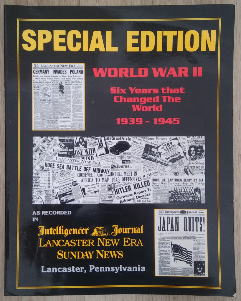
Earlier this year I was visiting family in Pennsylvania when I stumbled across a book entitled Special Edition World War II: Six Years that Changed the World, 1939-1945, containing reproductions of the front pages of the Intelligencer Journal, Lancaster New Era, and Sunday News from those years. I bought it at once. It’s an amazing resource, showing not just how contemporaries witnessed the war years, but specifically how they were covered by the newspapers of a relatively small provincial city. The paper’s article on Pearl Harbor, for example, features an inset covering a sailor from Lancaster who was stationed at Hickam Field. This map, provided by the United Press, dates to May 10th, 1940, the same day that Germany launched Fall Gelb, the stunningly successful invasion of France, Belgium, and the Netherlands. It’s another example of this wonderful series of attempts to communicate the strategic situation to the public, published right at the moment when that situation irrevocably shifted.

Can Hitler invade England this year? Will he? To us, those are questions of alternate history–and not particularly interesting ones, for that matter. Most students of World War II will tell you that Operation Sea Lion was never more than a pipe dream, and that the Nazis never had anything close to the resources needed to successfully carry it out. But to Americans in 1941 who’d watched France–widely regarded then as one of the most powerful countries on Earth–be humiliated and crushed by the Wehrmacht in only three months the previous year, it was a very real topic of concern. The Intelligencer Journal here attempts to game out the scenarios, examining how the new, ill-understood weapon systems of submarines and aircraft might allow Hitler to do what Napoleon never could.
There is something surreal about seeing charts of German airborne landings in England, not presented in a speculative fiction novel, but in the respectable local paper of a small American city, alongside headlines like “County Youth, 19, Has Meningitis” and “Poultry Meeting at Maytown High.”

Here we see another example from the same source, this time showing a diagram of the Allied landing of Operation Torch in November 1942. There’s a few reasons I wanted to spotlight this. First is the granularity of it, and the window it gives us into how people would have experienced these events. We see this as history, as clean lines on a map representing something immovably fixed in the past. But seventy years ago, Americans would have used maps like this to try and keep track of where their family members were, what they were doing, what they were facing. Operation Torch was the first large-scale US involvement in the European theater, and for those left behind at home, maps like this would have been their only way of knowing exactly what their loved ones were facing.
The other thing I love about this is that the creator seems to have added a completely fictional Free French advance up from Lake Chad through southern Tripolitania to outflank the Afrika Korps, something that would have been wildly impractical given that the Sahara Desert was in the way, and (as far as I know?) never even contemplated by Allied High Command. You can’t always trust what you read in the newspapers.

I love this so much. We’ve talked a lot here about hindsight and perspective, and about how people living through events often have a very different way of looking at them than we do. But this “Ten Year Map” shows us that sometimes, people understand very well what they’re seeing. The Intelligencer Journal published this in November 1939, just a few months into the general European war, but what it does beautifully is place that war into the context of the geopolitical chaos that had engulfed the world over the preceding decade. “What The Decade Has Done To The Map” indeed. We see here not just German expansion in central Europe, and war with Poland, but the Spanish Civil War, the Italian invasion of Ethiopia, Japan’s conflicts with China and Russia, border disputes in South America and the Middle East, the growth of long-distance air travel, and how the New Deal and Tennessee Valley Authority reshaped the American landscape. The 1930s were an extraordinarily tumultuous decade, as the fragile post-WWI order began to implode, and I’ve never seen a better illustration of it. All put together like this, we can really see the fracture points and battle lines of the new world war coming into view.
And it’s all the more remarkable to realize that they were seeing this as it happened, in real time, unable to do anything but watch and read the morning paper.